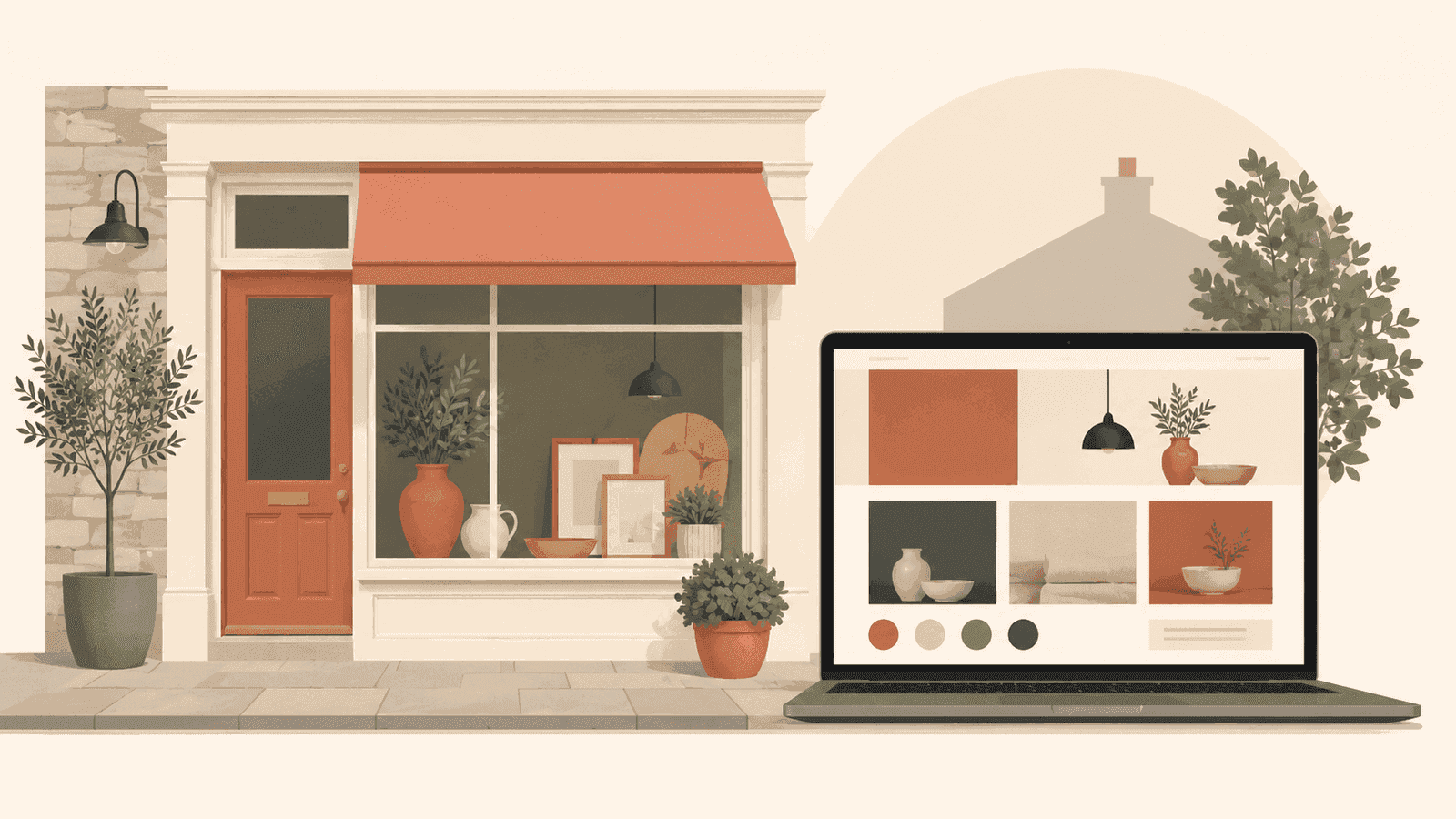
There's a temptation, when commissioning a new website, to want more of everything. More features, more sections, more animations, more colour. The reasoning is understandable: if we're paying for a new site, it should feel substantial.
But the most effective websites we've built - for agencies, consultancies, and professional services firms - tend to have one thing in common: they're stripped back rather than stacked up.
This isn't minimalism for its own sake. It's a deliberate conversion strategy.
Why visual complexity hurts conversions
When a visitor lands on your site, they're making a series of rapid decisions. Do I trust this business? Is this for me? What do they want me to do next? These decisions happen in seconds, often before any conscious analysis kicks in.
Visual complexity slows this process down - and not in a way that helps you. When there are ten things competing for attention, the visitor focuses on none of them. The result is what UX researchers call "choice paralysis": the visitor leaves rather than commit to a path.
A minimal site removes that friction. One or two clear focal points, a single call to action, structured whitespace that guides the eye. Visitors understand what you want them to do because there's nothing else to look at.
The authority signal of restraint
Minimalism also carries an implicit message about the business behind the site. Consider two agency websites. One has eight different sections on the homepage, four distinct call-to-action buttons, a looping video background, and an animated chat widget. The other has three clear sections, a single headline, one primary action, and nothing else.
Which feels more confident? Which feels like it was built by a team that knows exactly who their clients are?
For professional services - agencies, consultancies, law firms, financial advisers - restraint is a trust signal. It says: we're secure enough in our positioning that we don't need to shout.
Black and white as a design choice
High-contrast black and white design carries this further. When a site uses a monochrome palette deliberately, it does something clever: it forces the quality of the typography, layout, and content to do all the work.
There's no gradient to hide behind. No hero image to distract. The design lives or dies on its structure and its words.
When it works - and with the right brief, it almost always works - the result is a site that feels authoritative, precise, and modern without trying to be fashionable. It ages better than trend-led design. It looks as good in three years as it does today.
Getting the balance right
There's a version of minimal design that goes wrong: sites that are sparse because they're unfinished rather than deliberate. The difference is in the details.
Good minimal design has:
- A clear typographic hierarchy. Headings, subheadings, and body text that feel purposeful and sized correctly for the reading experience.
- Intentional whitespace. Spacing that guides the eye rather than filling awkward gaps.
- One primary action per page. Not zero, not five - one.
- Content that earns the space it takes. Every line of text should justify its presence.
If any of those elements are missing, a minimal design starts to feel empty rather than confident.
When to consider a minimal approach
Minimal design works best for businesses where credibility and trust are the primary conversion drivers: professional services, B2B agencies, consultancies, technical teams.
If your clients are making significant investment decisions - and they are - a bold, stripped-back site signals that you take your own brand seriously. Which, implicitly, suggests you'll take theirs seriously too.
If you're considering a site redesign and want to understand whether a minimal approach is right for your business, we're happy to talk it through.