The number one reason UK schools abandon EdTech platforms isn't price. It isn't even functionality. It's staff adoption.
A department head signs up, the subscription gets approved, and then six months later the platform is quietly unused because half the teachers found the dashboard confusing and reverted to spreadsheets.
This is a design problem. And it's almost entirely preventable.
Why teachers are a harder UI audience than most
Teachers are not tech-averse. They use complex tools every day - markbooks, MIS systems, assessment platforms. But they use them under enormous time pressure. A lesson starts in three minutes. A parent meeting ends in ten. If your interface requires exploration to understand, it will be abandoned.
The design implication is stark: every action a teacher needs to take in your platform must be achievable within two or three interactions, with no ambiguity about what happens next.
The three biggest UI failures in EdTech platforms
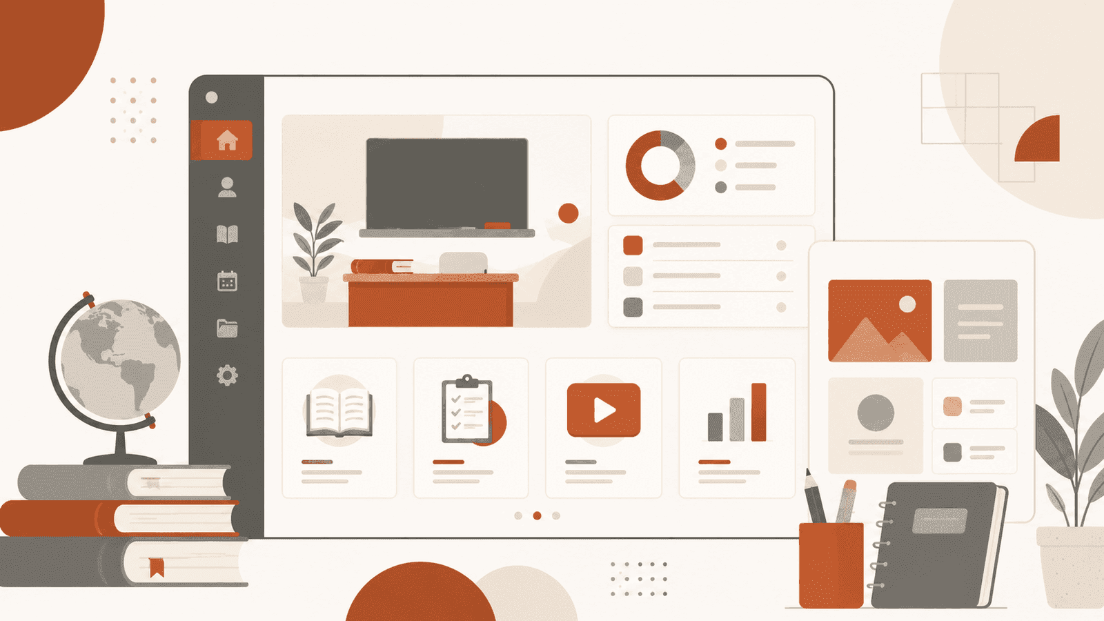
1. Treating all users as one user
A student logging in to complete a revision session has completely different needs from a teacher logging in to set assignments and review class performance. They should see completely different dashboards - same visual language, different information hierarchy.
When platforms try to serve everyone from a single view, nobody gets a view that works for them. Teachers start ignoring the noise. Students get overwhelmed. Administrators can't find the reports they need.
Design distinct entry points and role-specific dashboards. The effort pays for itself in adoption rates within the first term.
2. Burying the most common actions
Audit what your users do 80% of the time. In most EdTech platforms, teachers spend the vast majority of their time on three to four actions: setting tasks, reviewing completion rates, flagging students for follow-up, and accessing reports.
Those four things should be one click away from every screen. Not in a menu. Not in a sidebar submenu. Immediately accessible, labelled in plain English, with no ambiguity about what tapping them will do.
3. Ignoring the first-use experience
The first time a teacher logs in to a new platform, they're forming an impression that will determine whether they come back. If the first screen asks them to configure twelve settings before they can do anything useful, most will close the tab.
Onboarding for education platforms needs to be progressive. Show one thing. Let them do it. Then show the next thing. The goal of day one is not full feature adoption - it's one successful action that proves the product is worth learning.
What good education platform UI looks like in practice
A well-designed education platform UI has a few consistent characteristics:
- Calm visual hierarchy. Not flat and boring - but not competing for attention either. The information that matters most should have the most visual weight. Secondary information should recede.
- Predictable navigation. The same actions are always in the same place. Teachers especially value consistency - they're multitasking at all times, and muscle memory matters.
- Useful empty states. When a teacher logs in for the first time and a widget has no data yet, the empty state should explain what goes there and how to populate it. Empty states are a free onboarding moment that most platforms waste.
- Accessible by default. UK schools include students and staff with a wide range of visual and cognitive needs. WCAG AA compliance isn't optional - and designing for accessibility almost always produces better design for everyone.
The adoption dividend
When a platform's UI is genuinely easy to use, something interesting happens: teachers tell other teachers. Word of mouth within a school is powerful, and it moves faster than any marketing campaign.
The schools that renew subscriptions year after year are the ones where staff actually opened the platform and found it helpful on the first try. The design of that first experience is worth more than any onboarding email sequence.
At Octelis, we design platform UIs with adoption as the primary metric - not just aesthetics. If your EdTech product has great functionality that isn't reaching its users, get in touch and let's work out why.