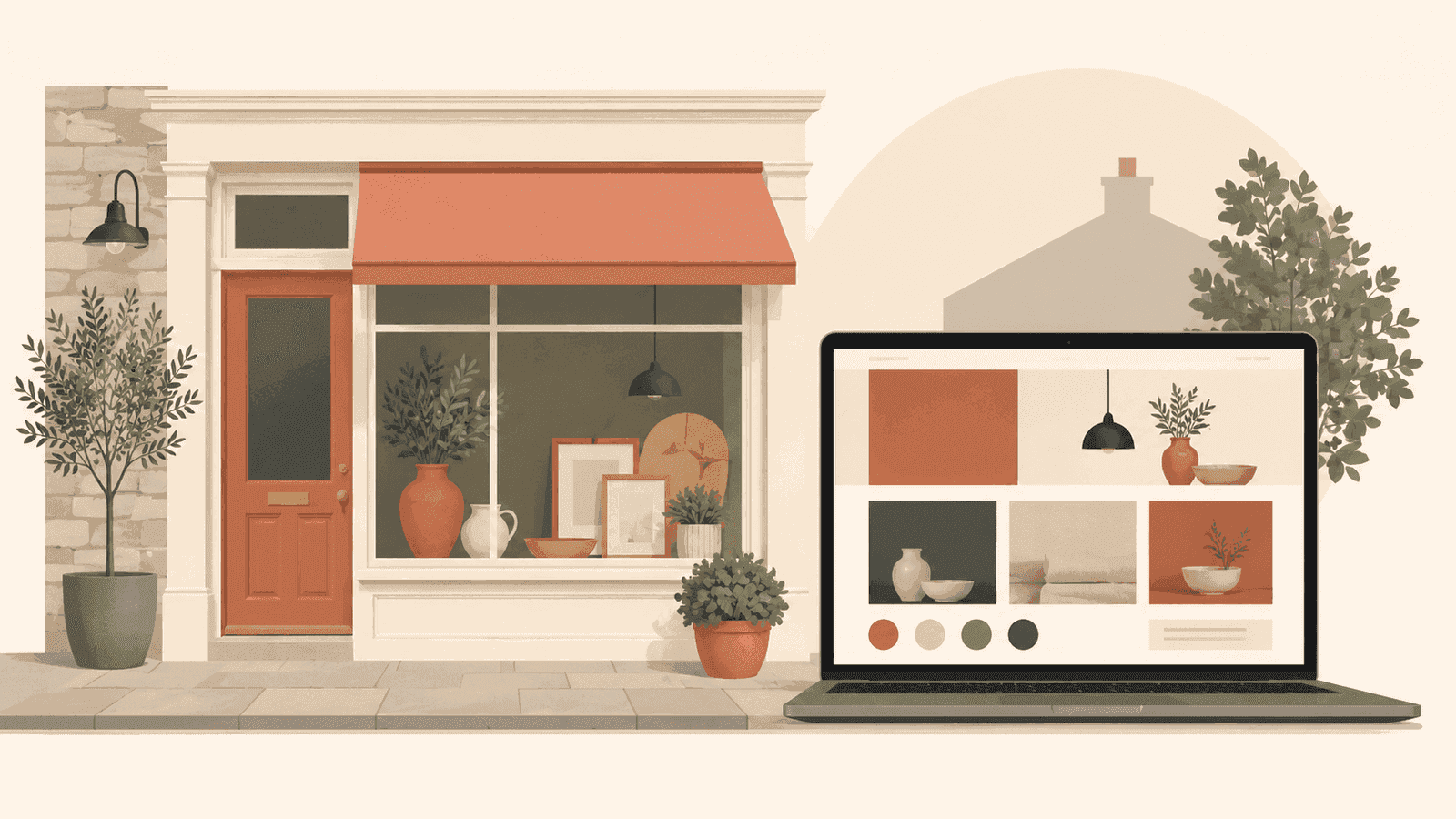
The first instinct for most new websites is to add: more colour, more animation, more content, more sections. The counterintuitive move - the one that often produces the better site - is to take things away.
Dark, minimal web design is a deliberate aesthetic choice. It communicates restraint. And restraint, in a web landscape full of sites competing for attention through noise, can be the loudest statement in the room.
This is not a style guide for making things look dark because dark is fashionable. It is an argument for when restraint is the right strategic decision - and what it takes to execute it properly.
Who dark minimal design works for
Not every brand should have a dark website. For a children's toy company or a local bakery, darkness would fight against the warmth and approachability the brand needs. Context always wins.
Dark minimal design tends to work best when:
- The work speaks for itself and needs room to breathe
- The brand is positioning itself at the premium or craft end of a market
- The target audience is sophisticated and will read restraint as confidence
- The founder or creative director wants to signal precision rather than personality
Portfolio sites for developers, designers, architects, and agency founders are natural fits. Technical product companies - particularly those selling to other professionals - often benefit from it too.
What makes dark minimal design actually work
The failure mode for dark minimal sites is that they end up looking empty rather than purposeful. The difference between empty and intentional comes down to a few things.
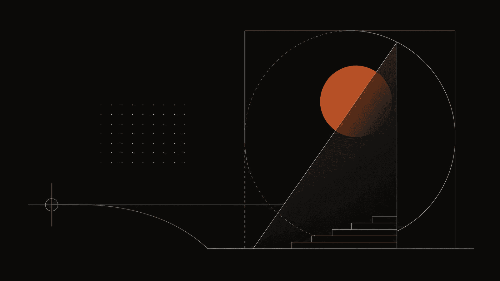
Typography must carry the weight. When you strip out colour and decoration, type becomes the primary visual element. This means font choice, size hierarchy, line height, and letter-spacing all need to be considered carefully. Poor typography on a dark minimal site is immediately obvious - there is nothing else to distract from it.
Contrast must be deliberate. Dark does not mean low contrast. The most successful dark sites use strong contrast ratios between background and text, with a single accent colour used sparingly. One warm accent against a dark background creates focus. Three accent colours creates confusion.
Spacing does the work that decoration cannot. Generous whitespace - or in the case of dark sites, darkspace - is not an absence of design. It is design. The breathing room between sections tells the eye where to move and gives individual elements weight they would not have if crowded.
Performance is non-negotiable. A dark minimal site that takes four seconds to load has failed its premise. The visual restraint implies technical confidence. A slow site undermines that signal immediately. Aim for under 1.5 seconds.
The pitfalls to avoid
Dark sites have their own set of failure modes beyond looking empty.
Readability suffers when the contrast ratio between text and background is too low. Dark grey text on a dark background fails accessibility standards and makes the site harder to read in most real-world lighting conditions. Test every colour combination against WCAG AA standards as a minimum.
Navigation can become invisible. On a bright site, a slightly-grey nav link is readable. On a dark site, it might disappear. Every interactive element needs to be clearly legible and obviously interactive.
Images need different treatment. Photographs that look fine on a white background can lose their impact on dark. Plan your image treatment - whether that means custom photography, illustration, or careful colour grading - as part of the design process rather than an afterthought.
When we built Tsvetanov.co.uk
For Kristiyan Tsvetanov's personal site, the dark minimal approach was the right call for specific reasons. The site needed to communicate precision and craft - qualities consistent with someone who designs websites professionally. A bright template would have undermined that message.
Every decision was deliberate: the type scale, the spacing, the single accent element used to create hierarchy. The result is a site that loads in 1.1 seconds and scores 98 on Lighthouse - which is what technical restraint looks like when it is executed properly.
What this means for your own site
If you are drawn to the dark minimal aesthetic, ask yourself honestly whether it fits your brand's intent. If the answer is yes, commit to it fully - half-measures produce sites that feel unresolved.
At Octelis, we design sites around the brand strategy, not a personal preference for a visual style. If dark minimal is right for your business, we will build it properly. If something else will serve you better, we will tell you that too.
Get in touch to talk through what your site actually needs.