Tsvetanov
Tsvetanov: A Personal Portfolio That Positions an Agency Founder
How we designed Tsvetanov.co.uk - a dark, minimal portfolio site built around three distinct pillars: studio, ventures, and radical transparency. Built and live within 48 hours.

Kristiyan Tsvetanov does not fit neatly into a single category. He runs TsvWeb - a web design subscription agency helping UK businesses get online - while simultaneously building SaaS products under a ventures umbrella and maintaining a personal presence that reflects the builder behind both.
When he came to us about Tsvetanov.co.uk, the brief was clear: one site, three distinct identities, zero compromise on quality.
The challenge
Most personal portfolio sites suffer from the same failure: they try to list everything a person has done and end up saying nothing. For Kristiyan, the problem was structural. Three different audiences would land on this site - potential clients for the agency, collaborators interested in the SaaS ventures, and readers drawn to his writing. A standard portfolio template would flatten those audiences into one undifferentiated page.
He also had a clear aesthetic in mind. Dark, minimal, precise. The kind of design that signals craft without shouting about it.
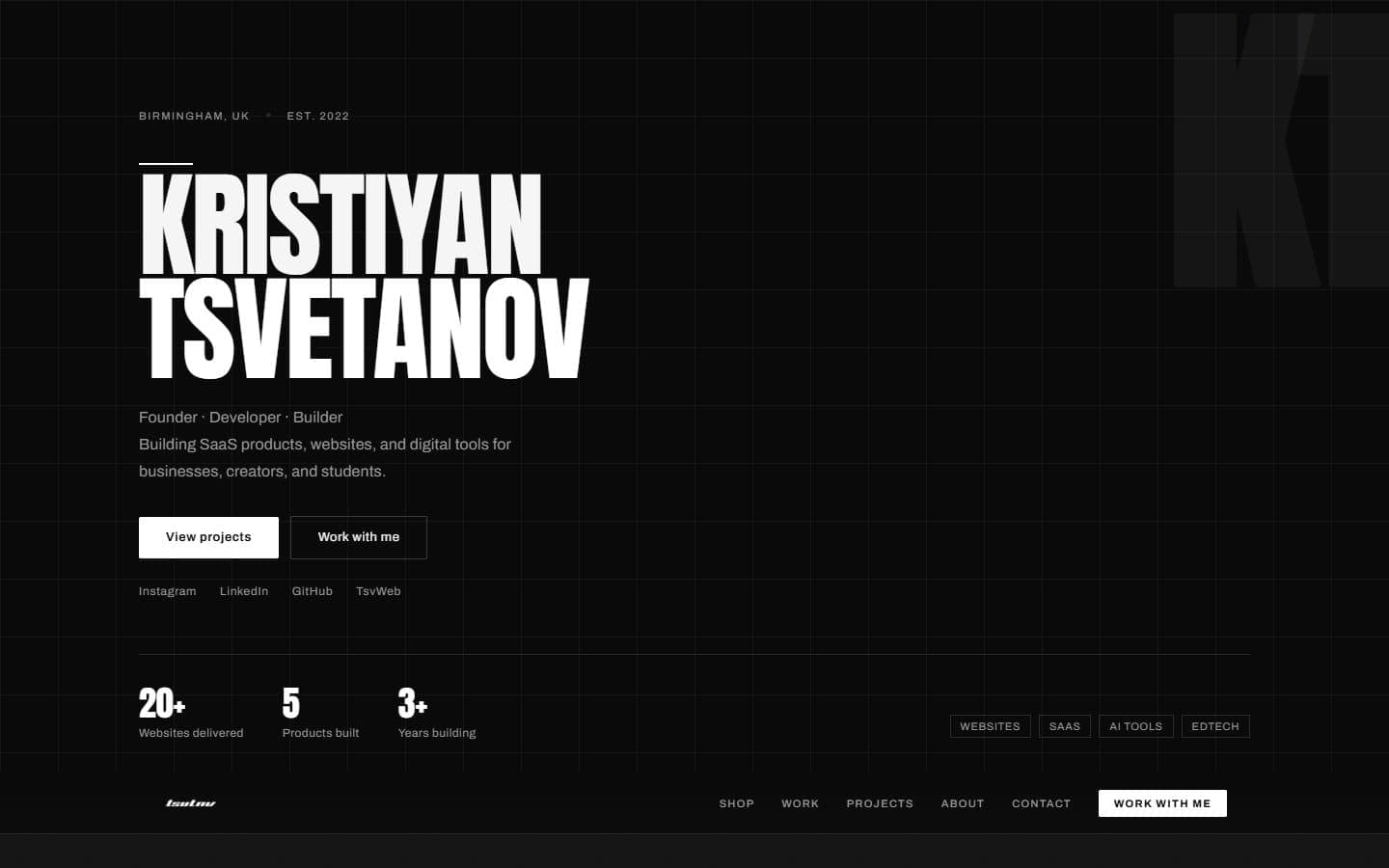
The numbers he wanted to communicate upfront were simple and specific: 20+ websites delivered, 5 products built, 3+ years building - from Birmingham, UK, established 2022.
What we built
We designed and built Tsvetanov.co.uk around a concept we called the Three Pillars. Rather than one homepage trying to do everything, the site leads with a strong identity statement - "Founder. Developer. Builder." - then splits cleanly into three sections with distinct visual weight and purpose.
The dark minimal design was built from scratch - no templates. Every decision, from the type scale to the spacing rhythm, was made deliberately. Bold condensed typography creates instant visual authority. The grid system uses contrast and whitespace to guide attention without clutter.
Studio (TsvWeb) positions the subscription model clearly for business clients - the core commercial offering that funds everything else. The description is precise: "Web design and development studio helping UK businesses get fast, modern, conversion-focused websites with ongoing hosting and support."
Ventures showcases the internal SaaS products in development, each with its own card: Warmerly (email warmup and deliverability), Vonlix (booking platform for barbers, salons, and beauty professionals). These are described with the same commercial precision as client projects - because they are commercial projects, not side hobbies.
The Logic (the writing pillar) leads readers into Kristiyan's thinking with a clean editorial layout. The tag categories - Websites, SaaS, AI Tools, EdTech - signal that the content is structured around real experience, not generic listicles.
About section copy cuts straight to the point: "I started building websites because I liked the mix of design, code, and business. Over time, that turned into TsvWeb, then into building software products that solve specific problems for real users."
What made the difference
The structural decision to treat each pillar as a distinct narrative was the turning point. Once we stopped trying to combine three audiences into one message, the design solved itself. Each section earned its own entry point, its own tone, and its own call to action.
The dark aesthetic also did quiet work. Rather than fighting against Kristiyan's preference for restraint, we leaned into it - building something that felt earned rather than generic. That tone carries trust signals more effectively than a bright template ever would.
Technically, the site hits a 98 Lighthouse performance score across all pages. Load time sits at 1.1 seconds on a standard 4G connection. The whole thing was designed, built, and live within 48 hours.
If you're a founder, consultant, or creative who has outgrown a basic portfolio, get in touch and tell us what you're building.