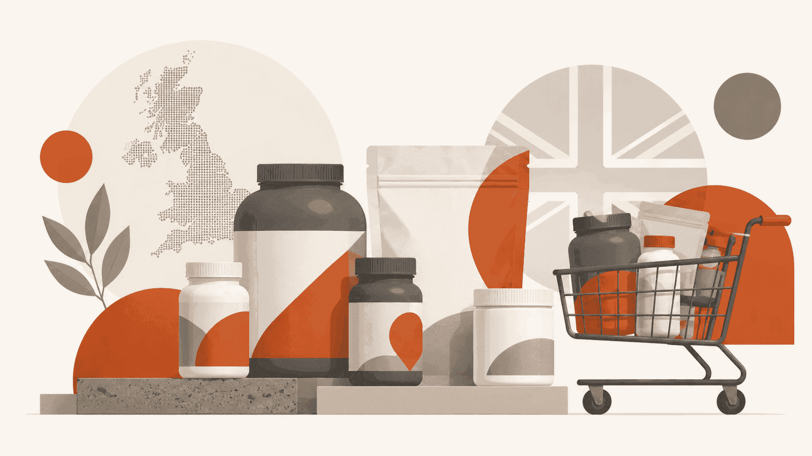
Walk into any UK gym and look at the supplement shelf. There are dozens of brands competing for the same customer, often with identical claims on the label. The product that gets picked up first is almost always the one with the most distinctive visual identity.
The same dynamic plays out online - except online, a customer can close your tab in under three seconds and never come back.
Here's why brand identity is worth taking seriously if you're building or growing a fitness product business.
What brand identity actually means for a supplement brand
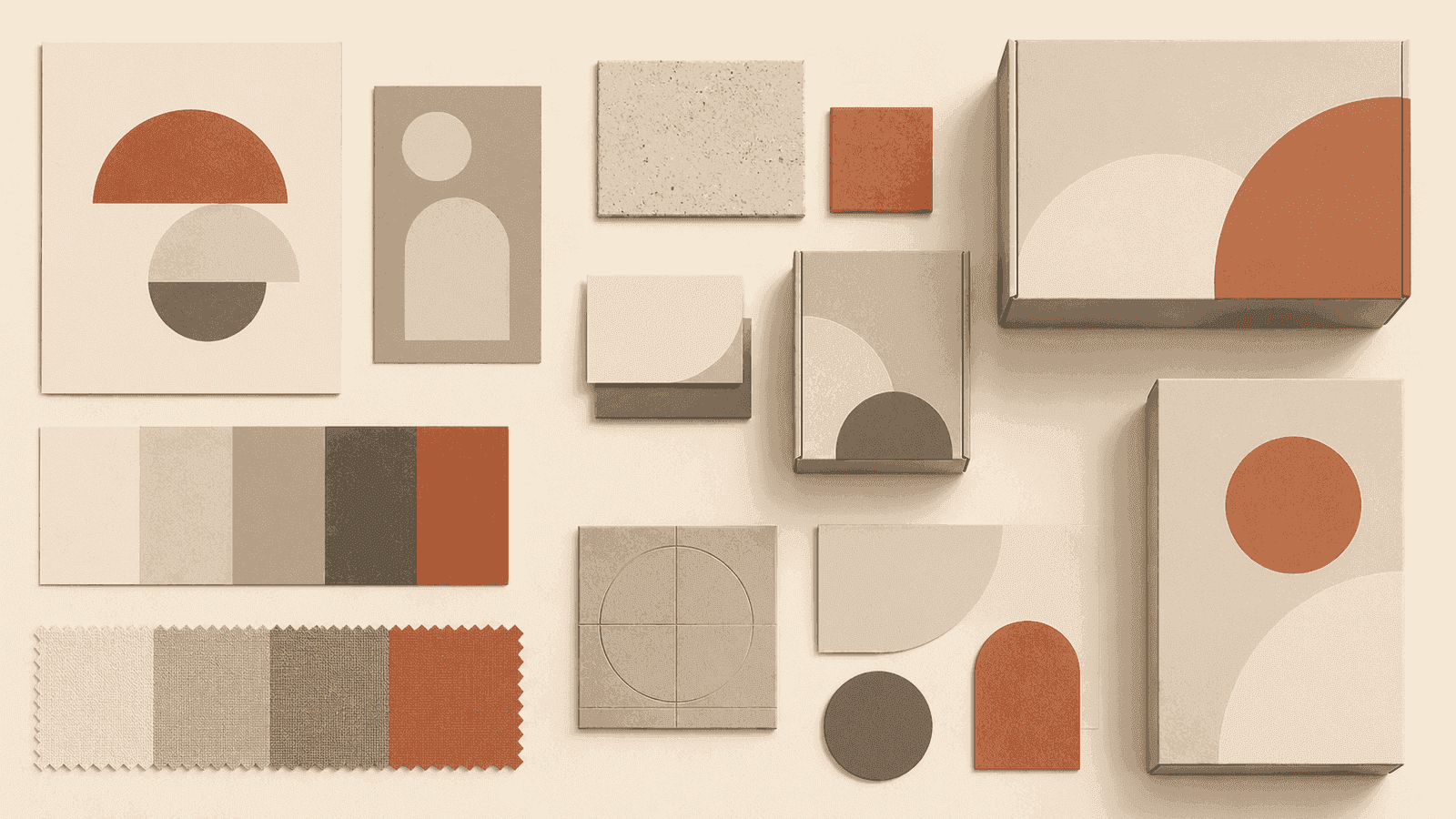
Brand identity isn't just a logo. It's the system of visual decisions that makes your brand instantly recognisable: colour palette, typography, photography style, how you lay out a product page, the tone of your label copy.
When these elements are consistent, something interesting happens. Customers start to recognise your brand before they read the name. That recognition is worth something - it lowers the barrier to purchase because familiarity reads as trust.
For supplement brands specifically, trust is the primary conversion variable. A customer buying a protein powder is making a judgement about whether your product is safe, effective, and worth their money. A professional, consistent visual identity is one of the fastest ways to clear that bar.
The problem with trend-chasing design
The supplement industry has a tendency to follow aesthetic trends in clusters. A few years ago, everything was neon green on black. Before that, camouflage and aggressive military iconography. Right now, many brands are using the same muted earthy tones in an attempt to signal "natural" and "clean."
Following a trend makes your brand look contemporary for a year, then dated for ten. It also makes you visually indistinguishable from everyone else who followed the same trend.
A better approach is to develop a visual language rooted in your specific positioning. If your brand is about performance and intensity, bold contrast and dynamic typography communicate that. If it's about recovery and wellbeing, quieter tones and spacious layouts do the work. The key is that the aesthetic decision comes from the brand's actual character, not from what looks good on Instagram this month.
Colour does heavier lifting than most founders expect
Colour is the first thing a buyer perceives and the last thing they consciously think about. In the supplement category, where products are often bought repeatedly, colour becomes a navigation tool - customers scan for "the yellow one" or "the black and white tub" before they recall the brand name.
This is why owning a distinct colour palette is worth the investment. Pick two or three colours that work together, that aren't already dominated by a competitor in your space, and apply them with discipline across packaging, website, and social content.
Typography signals quality
Poor typography is one of the most common identifiers of a low-budget brand, and customers pick up on it without knowing what they're responding to. Inconsistent font sizes, multiple typefaces on one page, body text set too small for mobile - these create a vague sense of unprofessionalism that erodes trust.
For fitness brands, bold display typography often works well for headings - it reflects energy and confidence. Pair it with a legible, neutral body typeface and apply both consistently. That combination alone will put your site ahead of the majority of UK supplement retailers.
Brand identity compounds over time
The strongest reason to invest in brand identity early is that its value compounds. Every product photo, social post, and email you send either reinforces or dilutes your visual language. If the foundation is solid, each piece of content you produce makes the brand stronger. If it isn't, you're building on sand.
Octelis builds brand identities and e-commerce websites for UK fitness and supplement brands. Get in touch if you want to talk about what your brand needs to stand out.